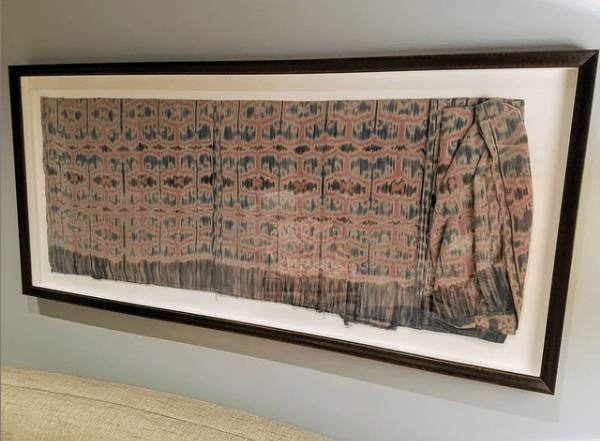
At Prints Unlimited, we’re familiar with unique art framing projects. One of our long-time clients, Steve Quinlan, recently tasked us with the framing of a 20th-century Indonesian antique sarong. Both long at 21″ x 72″ and delicate from wear, the textile was something our staff knew had to be handled with care, but there was an added challenge in store.
Steve Quinlan has been a Design Consultant for several years, covering projects ranging from small-scale designs like the bedroom of a 16-year-old to the gut rehab of 3,200 square foot units in a high rise on the Gold Coast. “I’m known for using what people have. To me, it’s what makes a house a home.”
His recent client was making the move from Chicago into a suburban townhouse. Initially, Steve was hired to install artwork, but the project grew to where he also curated art and reupholstered existing furniture for the client. When sourcing art for the client’s new home, they explored Primitive, a showroom located in Chicago featuring global antiques. That is where they found the Sulawesi ikat sarong that would enter Prints Unlimited’s framing purview.
When they brought the sarong into our shop, the client made a special request, asking if the fabric could be shaped and framed in a way to allude to what it is. Our salesperson, Jill, was prepared to frame the textile exactly as Steve laid it out. Steve created the inspired shape of the garment, “My client had this great idea of tying it like it would be tied when it’s worn. I whipped up the fold with a flourish and that was how we decided to display it.”
The unique folds now built into the design of the antique sarong posed a worthy challenge to our custom framing and mounting expert, Jon, who spent nearly two days sewing down the individual curves and crevices of the folded fabric by hand. “There was the issue of matching exactly what the designer requested while making sure the sarong was sewn down securely.”The choice behind the design of the frame and backing was important in letting the sarong stand on its own while providing a clean backing for it to be mounted to. Jill explained, “We explored a couple of shadowboxes, but we decided on a faux leather frame and a white linen backing.”
The final artwork represents the ideal collaboration of designer and framer through idea and execution. Both Steve the designer and his client were pleased with the results. “Jill is a joy to work with. She knows her stuff, she is really helpful to get you to the next level. I believe framing is a collaborative effort. Jill has such a winning positive attitude and gets how I work.”

